
Key Takeaways
- Use a figure when the pattern, trend, relationship, or image is the message; export it as vector (PDF, EPS, SVG) for graphs and line art, and as high-resolution raster (TIFF or PNG at 300-600 dpi) for photographs and micrographs.
- Design every figure to be legible at its final printed size: sans-serif fonts of 6-12 points after reduction, line weights of at least 0.5 point, and colorblind-safe palettes that retain key information even after being changed to greyscale.
- Write captions that let the figure stand alone: what is shown, in whom or what, with every panel, symbol, abbreviation, error bar, and scale bar defined.
- Never manipulate images beyond uniform whole-image adjustments; journals screen for spliced gels and altered micrographs, and violations can end in retraction.
Key Terms
Figure preparation has a technical vocabulary drawn from graphic design and publishing. These are the terms used throughout this guide and in most journal author instructions.
| Term | Definition |
| Raster (bitmap) image | An image made of a fixed grid of pixels, such as a photograph; it loses quality when enlarged. |
| Vector image | An image defined by mathematical paths (lines, curves, text) that scales to any size without quality loss. |
| DPI / PPI | Dots (or pixels) per inch: the density of a raster image at a given print size, which determines sharpness. |
| Resolution | The pixel dimensions of a raster image, for example 3000 x 2400 pixels. |
| Caption (legend) | The numbered text below or beside a figure that titles and explains it. |
| Key | The part of a figure or caption that defines symbols, line styles, or colors. |
| Panel | One sub-image within a multi-part figure, labeled A, B, C. |
| Scale bar | A labeled bar on an image indicating physical size, required for micrographs and maps. |
| Lossy compression | Compression that discards image data to shrink files (JPEG), creating artifacts around sharp edges. |
| CMYK / RGB | Color models for print (CMYK) and screens (RGB); journals specify which to submit. |
| Bleed / column width | Layout limits for figures; most journals set single-column and double-column maximum widths. |
| Colorblind-safe palette | A color set distinguishable by readers with color vision deficiency, such as avoiding red-green pairs. |
Why Do Figures Matter in a Research Paper?
Figures matter because most readers process them before, and often instead of, the text in a research paper: surveys of reading behavior show that scientists typically scan the abstract and figures first and decide from those whether the paper deserves a full read. Your figures are therefore the paper’s storefront, and each one should be able to communicate its point with only its caption for support.
Figures also do work that text and tables cannot. A scatterplot reveals outliers and nonlinearity that a correlation coefficient hides; a flow diagram shows a study design in seconds; a micrograph is itself the evidence. At the same time, figures are the most technically demanding display items: they must satisfy resolution, format, size, font, and color rules that vary by journal, which is why figure files are the most common cause of technical rejection before peer review.
Figure or Table: A Quick Recap
The rule from the companion decision is symmetrical: tables carry exact values; figures carry patterns, relationships, shapes, and images. Choose a figure when readers should see a trend over time, a difference in distributions, a spatial arrangement, a workflow, or physical evidence such as a photograph. Choose a table when readers will need the precise numbers.
Never present the same data in both forms, and never turn two or three numbers into a chart; state them in the text instead.
Choosing the Right Type of Figure
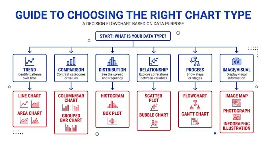
Matching figure type to data type is the first design decision, and mismatches (a pie chart for continuous change, a bar chart hiding a bimodal distribution) are among the most common reviewer complaints. The table below maps common purposes to standard figure types.
| Purpose | Recommended Figure Types | Notes |
| Trend over time | Line graph | Time on the x-axis; limit to 4-6 lines |
| Comparison between groups | Bar chart, dot plot | Start bar axes at zero; show error bars |
| Relationship between variables | Scatterplot with fit line | Shows outliers and nonlinearity |
| Distribution of data | Histogram, box plot, violin plot | Prefer these over bars of means |
| Parts of a whole | Stacked bar | Pie charts are discouraged by many journals |
| Process or study design | Flow diagram, schematic | Required as PRISMA or CONSORT diagrams in reviews and trials |
| Physical evidence | Photograph, micrograph, gel image | Needs scale bars and integrity safeguards |
| Spatial data | Map, heat map | Include a legend and scale |
How Many Figures Should a Research Paper Have?
Most original articles carry 3 to 6 figures, and journals commonly cap combined tables and figures at 5 to 8, so check the author guidelines before building anything. A typical allocation is one schematic or design figure, one or two main-result figures, and one or two supporting figures. If your plan exceeds the cap, combine related plots into a multi-panel figure, and move confirmatory or granular material to the supplement.
Figure Captions, Numbering, and Panel Labels
What Makes a Good Figure Caption?
A good caption opens with a brief title phrase stating what the figure shows, then adds the detail a reader needs to interpret it without the main text: the system or sample, the conditions, and definitions of every visual element. A complete caption for an experimental graph typically includes:
- A declarative or descriptive title phrase, for example ‘Treatment reduces symptom scores over 12 weeks’ or ‘Symptom scores by treatment group over 12 weeks.’
- The sample and conditions: species, cell line, population, n per group, and time frame.
- Definitions of all symbols, line styles, colors, and abbreviations that are not defined in an on-figure key.
- What error bars represent (standard deviation, standard error, or confidence interval) and the statistical test behind any significance markers.
- For images: staining or imaging method, magnification or scale bar value, and any labels or arrows explained.
Keep interpretation out of the caption beyond the title phrase: the caption explains what is shown, while the Results text explains what it means. Captions are typically 1-4 sentences for simple graphs and longer for multi-panel figures, where each panel gets its own labeled sentence.
Numbering and Panel Labels
- Number figures with Arabic numerals in order of first mention, in a sequence separate from tables; renumber if callout order changes.
- Label panels with bold capital letters (A, B, C) placed consistently, usually in the top-left corner of each panel, and reference them in the caption as (A), (B), (C).
- Supplementary figures use their own scheme, commonly Figure S1 or Figure A1, matching the journal’s convention.
- Place captions below figures in most styles; in APA 7, the bold label ‘Figure 1’ and an italic title sit above the image, with notes below.
Designing Clear, Honest Figures
Design determines whether a figure informs or misleads. The principles below apply to every chart type and are checked, formally or informally, by nearly all reviewers.
Axes, Scales, and Data Marks
- Label both axes with the variable name and its unit, for example ‘Plasma glucose (mmol/L).’
- Start bar chart axes at zero; truncated bar axes exaggerate differences and are treated as misleading. Line and scatter axes may be cropped if the break is obvious.
- Use logarithmic scales only when the data demand it, and say so on the axis.
- Show the data where feasible: overlay individual points on bars or box plots for small samples, and always show error bars with their meaning defined.
- Remove chart junk: 3D effects, background gridlines heavier than the data, decorative shadows, and redundant legends all reduce clarity.
Fonts, Line Weights, and Sizing
- Use a sans-serif font (Arial or Helvetica are the near-universal journal defaults) and keep the figure’s fonts consistent with each other.
- Size text so it lands at roughly 6-12 points after the figure is reduced to its final column width; axis labels around 8-10 points at final size is a safe target.
- Keep line weights at 0.5-1.5 points at final size; hairlines thinner than 0.5 point can disappear in print.
- Design at final size from the start. Most journals specify a single-column width of roughly 3-3.5 inches (about 8-9 cm) and a double-column width of roughly 6.5-7 inches (about 17-18 cm); a figure designed at poster scale and shrunk to one column becomes unreadable.
Color, Contrast, and Accessibility
- Use colorblind-safe palettes and never make red vs green the only distinction; roughly 1 in 12 men has a color vision deficiency.
- Pair color with a second channel (marker shape, line style, direct labels) so the figure still works in grayscale; some journals print in black and white or charge for color pages.
- Keep contrast high: light gray text on white, or yellow lines on white, will vanish in print and projection.
- Prefer perceptually uniform gradients (such as viridis-style scales) over rainbow gradients for heat maps, which distort how readers perceive magnitude.
- Write alternative text for each figure when the journal requests it: one or two sentences stating the figure type and its main message for screen reader users.
Which File Format Should You Use?
Use vector formats (PDF, EPS, SVG) for graphs, diagrams, and anything built from lines and text; use raster formats (TIFF or PNG) for photographs, micrographs, and blots; and avoid JPEG for anything containing text or sharp lines, because its lossy compression blurs edges. The format decision matters because it cannot be fixed later: a chart exported as a low-resolution JPEG cannot be converted back into a sharp vector file.
| Format | Type | Best For | Cautions |
| TIFF | Raster | Photos, micrographs, blots; the default journal raster format | Large files; use LZW lossless compression |
| PNG | Raster | Screenshots, web figures, line art rasters | Check that the journal accepts it; keep dpi high |
| JPEG | Raster (lossy) | Photographs only, when required | Never for text, lines, or gels; artifacts at edges |
| EPS | Vector | Graphs and line art for print pipelines | Legacy format; fonts must be embedded or outlined |
| Vector | Graphs, diagrams, mixed content | Embed fonts; one figure per file | |
| SVG | Vector | Editable graphs, web publication | Not accepted by all journals; convert if needed |
Two workflow rules protect quality. First, always keep the editable source file (the statistics script, the Illustrator or Inkscape file, the original camera or microscope output) so you can revise without rebuilding. Second, convert only downward: vector to raster is safe when a journal demands TIFF, but rasterizing early throws away editability and sharpness permanently.
What DPI and Resolution Do Journals Require?
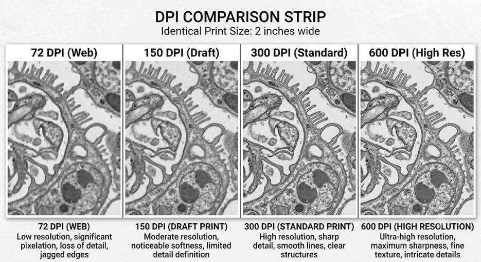
The near-universal minimums are 300 dpi for color and grayscale photographs, 600 dpi for images that combine photos with text or lines, and 1000-1200 dpi for pure black-and-white line art, all measured at the figure’s final printed size. DPI only has meaning together with print size: a 1200 x 900 pixel image is 300 dpi at 4 x 3 inches but only 150 dpi at 8 x 6 inches.
| Figure Content | Minimum DPI | Pixels for a 3.5-inch Column |
| Color or grayscale photograph | 300 dpi | About 1050 pixels wide |
| Photo combined with labels or lines | 600 dpi | About 2100 pixels wide |
| Pure line art (if rasterized) | 1000-1200 dpi | About 3500-4200 pixels wide |
Practical cautions
- First, never upsample: increasing a 72 dpi screenshot to 300 dpi in an editor adds pixels but no detail, and journals detect it. Capture or export at high resolution from the start.
- Second, set resolution at export time in your analysis software (for example, an export option such as dpi = 300 or higher) rather than resizing afterward.
- Third, check the journal’s file size limits; a 600 dpi TIFF of a large image can exceed upload caps, in which case lossless compression or the journal’s preferred alternative format solves it.
Technical Specifications Checklist
Beyond format and resolution, journals impose layout and typography specifications. The most common ones are summarized below; the author guidelines of your target journal always take precedence.
| Specification | Common Requirement | Why It Matters |
| Width | Single column about 8-9 cm; double column about 17-18 cm | Figures are laid out to column grid |
| Font | Arial or Helvetica, 6-12 pt at final size | Legibility after reduction |
| Line weight | 0.5-1.5 pt at final size | Thinner lines drop out in print |
| Color model | RGB for online-only; CMYK for print | Colors shift between models |
| File naming | Fig1.tif, Fig2.pdf, one figure per file | Production tracking |
| Text in figures | No titles inside the image; titles go in the caption | Journal styles set titles in the caption |
| Multi-panel assembly | Panels aligned, evenly spaced, labeled A, B, C | Assembled by you, not the typesetter |
Software for Creating Research Figures
No single tool covers every figure type, and most published figures pass through two stages: a plotting or imaging tool that produces the raw graphic, and a layout tool that assembles panels, adjusts fonts, and exports to journal specifications. Choose based on your data workflow and budget; the categories below cover the standard options.
| Category | Representative Tools | Best For |
| Code-based plotting | R (ggplot2), Python (Matplotlib, Seaborn) | Reproducible statistical graphics regenerated from scripts |
| Point-and-click statistics | GraphPad Prism, OriginLab, SPSS | Lab-style graphs with built-in statistics |
| Spreadsheets | Excel, Google Sheets | Quick drafts; export limits make them weak for final figures |
| Vector editing and layout | Adobe Illustrator, Inkscape, Affinity Designer | Multi-panel assembly, schematics, final polishing |
| Image processing | ImageJ / Fiji, Photoshop (uniform adjustments only) | Micrographs, gels, scale bars, measured images |
| Diagrams and schematics | BioRender, PowerPoint, draw.io | Study design flows, pathway and mechanism diagrams |
Selection tips
- First, prefer script-based plotting when analyses will be revised, because regenerating a figure after a data correction takes seconds instead of an evening.
- Second, whatever tool you use, confirm it can export vector PDF or EPS and high-dpi TIFF; a tool that only exports low-resolution PNG will fail journal checks.
- Third, keep statistics out of drawing tools: compute in your analysis software and use the drawing tool only for layout, so numbers are never retyped.
Figures for Supplementary Data and Appendices
When Should a Figure Go to the Supplement?
Move a figure to the supplement when it supports transparency rather than the central argument: if the average reader can follow every claim without seeing it, it belongs outside the main text. Common candidates include:
- Robustness and sensitivity plots that repeat a main figure under alternative assumptions.
- Full-resolution or uncropped versions of images cropped in the main text, including whole gel and blot images, which many journals now require as supplementary integrity evidence.
- Quality-control graphics, instrument validation plots, and diagnostic residual plots.
- Extended galleries, such as images for every sample when the main text shows one representative example.
Preparing Supplementary Figures
- Number them in their own sequence (Figure S1, S2) in order of citation, and cite each one at least once in the main text.
- Hold them to main-text standards for captions and labeling; supplements are usually published without copyediting, exactly as submitted.
- Resolution rules are often relaxed for supplements, but keep images sharp enough for reviewers to actually evaluate.
- Follow the journal’s packaging rules: some want one combined PDF of all supplementary figures with captions, others want individual files.
Referring to Figures in the Text
Every figure needs a callout near its first relevant claim, and the callout should give readers a reason to look: ‘Symptoms declined fastest in the first four weeks (Figure 2)’ works harder than ‘Figure 2 shows the results.’ Cite figures by number, never by position, keep callouts in numerical order, cite specific panels as (Figure 2B) where it helps, and let the text interpret the figure rather than re-describe it. At submission, most journals want figure files uploaded separately with the captions listed together in the manuscript; the final layout placement is the typesetter’s job.
See also: How to Write an IMRAD Paper: Outlines, Examples, Checklists
Image Integrity: What Editing Is Allowed?
Only uniform, whole-image adjustments are acceptable: modest changes to brightness, contrast, or color balance applied equally to the entire image, disclosed if significant. Everything else risks a misconduct finding. Journals now screen submitted images with forensic software, and image problems are a leading cause of retractions. The bright lines are:
- Never adjust, enhance, erase, move, or duplicate any specific feature within an image.
- Never splice lanes from different gels, or from different exposures of one gel, into an apparently single image; if grouping is unavoidable, mark the boundary visibly and disclose it in the caption.
- Never let cleanup obscure or eliminate information present in the original; keep the unmodified original file, which journals can request.
- Disclose all processing steps (software, adjustments, cropping) in the methods or caption when the journal requires it.
Common Figure Mistakes and How to Fix Them
| Mistake | Why It Hurts | Fix |
| Text unreadable at final size | Figure fails at one-column width | Design at final size; 8-10 pt labels |
| Low-resolution or upsampled images | Fails technical check; looks blurry | Export at 300-600 dpi from the source |
| JPEG used for line art or gels | Compression artifacts around edges | Use TIFF or PNG for rasters, vector for graphs |
| Truncated bar chart axis | Visually exaggerates differences | Start bars at zero or switch to a dot plot |
| Red-green only color coding | Invisible to colorblind readers | Safe palette plus shape or line-style cues |
| Undefined error bars or symbols | Figure cannot stand alone | Define everything in the caption or key |
| Missing scale bar on images | Size cannot be judged | Add a labeled scale bar to every image panel |
| Same data as figure and table | Prohibited duplication | Keep one presentation |
Example of a Publication-Ready Figure
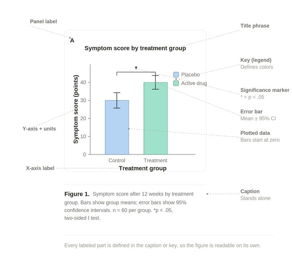
Here is the anatomy of a publication-ready figure, using a simple two-group bar chart as the worked example. Each dashed leader points to one part that a complete figure needs, and every one of those parts is either self-explanatory on the plot or defined in the caption or key beneath it.
The ten labeled parts break into three groups:
- On the plot itself: the panel label (the bold A that identifies this sub-image in a multi-panel figure), the title phrase, the plotted data (bars starting at zero so heights are not exaggerated), the error bars, and the significance marker (the star and bracket linking the two groups).
- The scaffolding that makes values readable: the y-axis label with its unit in parentheses, the x-axis label, and the key that maps each color to a group. Note that the axis units and the key are what let a reader decode any single bar without reading the text.
- Below the plot: the caption, which carries the numbered label, the sample size, the meaning of the error bars, and the definition of the significance marker. The caption is the one part that must let the whole figure stand alone.
A useful self-test when you build a real figure: cover the surrounding manuscript text and hand the figure plus caption to a colleague. If they can state what was measured, in whom, how many, what the error bars mean, and why the star is there, the anatomy is complete. If any of those answers requires the main text, the missing piece is usually the caption or the key.
Pre-Submission Figure Checklist
- Numbered in order of first mention, cited in the text, with panels labeled and referenced.
- Caption lets the figure stand alone: sample, conditions, n, error bars, symbols, abbreviations, and scale bars all defined.
- Correct format per content: vector for graphs, TIFF or PNG at 300-600 dpi for images, measured at final print size.
- Fonts, line weights, and figure width match the journal’s specifications; colors are colorblind-safe and can be changed to grayscale without loss of key information.
- Axes labeled with units; bar axes start at zero; no 3D effects or chart junk.
- Original unedited image files archived; all processing disclosed and within integrity rules.
- File names, file sizes, and packaging follow the journal’s submission system requirements.
Frequently Asked Questions
What DPI should figures be for journal publication?
At final printed size: 300 dpi for photographs and other halftone images, 600 dpi for combination images that mix photos with text or lines, and 1000-1200 dpi for rasterized black-and-white line art. Vector files have no dpi and are preferred for graphs. Always verify the numbers against your target journal’s artwork guidelines, since a few publishers set stricter values.
What is the best file format for scientific figures?
Vector PDF or EPS for graphs, charts, and diagrams, because they stay sharp at any size, and TIFF (with lossless compression) or PNG for photographs, micrographs, and blots. Avoid JPEG except for plain photographs when a journal specifically asks for it, and never use it for images containing text, lines, or gel bands.
What software do researchers use to make figures?
Most workflows pair a plotting tool with a layout tool: R with ggplot2 or Python with Matplotlib for reproducible statistical graphics, GraphPad Prism or OriginLab for point-and-click lab graphs, ImageJ or Fiji for microscopy images, and Illustrator, Inkscape, or Affinity Designer for assembling multi-panel figures and final export. Free options (R, Python, Inkscape, Fiji) cover the entire pipeline at publication quality.
How do you write a figure caption for a research paper?
Start with a short title phrase stating what the figure shows, then describe the sample and conditions, define every panel, symbol, color, and abbreviation, state what error bars represent and the statistical test used, and give scale bar values for images. The test of a good caption is that a reader who sees only the figure and caption can interpret it correctly.
How can I prepare my figures if I don’t understand design?
For researchers who don’t have the expertise or time for preparing artwork, the best option is a professional scientific figure preparation service like Editage. A professional illustrator can create vector artwork from scratch from a hand-drawn sketch or a reference image, so you get editable illustrations for your varied graphics needs. Such services can also enhance images you already have and formats existing figures to match journal guidelines, so whether you are starting from a napkin sketch or a finished-but-rejected figure, there is an option that fits.
Note that Editage does not edit photos, micrographs, CT scans, etc., but can change the text and captions within the image files to suit journal or other requirements. This lines up with research-integrity norms, since altering the content of a scientific photograph is exactly the kind of manipulation journals screen for.
What is the difference between vector and raster images?
Raster images are grids of pixels, so they have a fixed resolution and blur when enlarged; photographs are inherently raster. Vector images are mathematical descriptions of lines, curves, and text, so they scale to any size with no quality loss; graphs and diagrams should be created and submitted as vectors whenever the journal accepts them.
Can you use color figures in a research paper?
Yes, and online publication has made color the norm, but check two things first: whether the journal charges fees for color in the print edition, and whether your figure still works in grayscale and for colorblind readers. Use colorblind-safe palettes, add shape or line-style cues alongside color, and never rely on a red-green contrast alone.
How many figures can you have in a research paper?
Typically 3 to 6 in the main text, with many journals capping combined tables and figures at about 5 to 8; letters and brief reports allow fewer, and some open-access journals set no limit. If you are over the cap, merge related plots into multi-panel figures and move confirmatory material to the supplementary files.
Can I use AI-generated figures in a research paper?
While generative AI is useful, AI-generated images are still often inaccurate, and journals have strict rules regarding such images, making their use in manuscript submissions risky. Quality can also be an issue: low-resolution images can give journal editors a bad impression of your work, and graphics are often visible even in closed-access articles, making them an important entry point for communicating your results to readers.


Comment