Graphical Abstracts: Bridging the Gap Between Complex Data and Readers

Graphical abstracts in scientific research have captured the attention of journals, publishers, and authors worldwide. Although these visual abstracts were introduced in academic journals in 2011, science has always encouraged pictorial representations to simplify complex concepts.
Visual Summaries in Educational Context
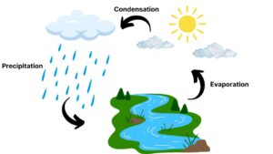
One of the first images that I can recollect is that of the water cycle! A quick glance at the image (forgive my crude drawing below) was sufficient for our young brains to recognize the key terminologies and explain the concept smoothly.
Because the human brain processes visual content faster than textual content, graphical abstracts have been considered effective for research dissemination, increased visibility, and simplifying complex data. However, summarizing an entire scientific paper in a single image can be challenging. So, how do you go about it? Read on!
Tips to Simplify Complex Concepts for Effective Graphical Abstracts
1. Identify the key information to be included.
Graphical abstracts are not meant to be a substitute for your entire research paper. They need not contain all the details about your research but just enough information for readers to understand the crux of your research. This includes a title for the image, your research methodology with relevant icons and terminologies, key findings, and conclusions.
Pro Tip: Recognize that less is more! Determine what details are crucial for readers to understand what your study is about.
2. Follow a suitable template.
Once you have identified the key components (title, methodology, results, and conclusions), choose an appropriate layout for your graphical abstract. Depending on your research, the graphical abstract can present a single panel, multiple panels, or a circular format.
Several publishers provide journal-specified templates for graphical abstracts. Additionally, tools like Mind the Graph and Canva offer a range of template options to choose from.
3. Use appropriate icons with the right color palette.
Scientific illustrations significantly differ from non-scientific graphics. Therefore, it is crucial that appropriate icons and symbols are used to visually represent your study. Again, Mind the Graph brings you a range of illustrations suitable for varying categories, such as cell biology, genetics, zoology, nutrition, nanotechnology, and many more.
A clear and impactful graphical abstract has a limited color palette. Do not overload the visual abstract with colors—3 to 5 colors with a mix of light, medium, and dark shades are recommended.
4. Include textual information wherever necessary.
Text-heavy graphical abstracts are discouraged. However, not offering any textual information can mislead readers. Your graphical abstract should contain key terminologies, definitions, statistical data, or any other detail that seems relevant for the readers to understand your visual representation.
Pro Tip: Recognize the balance between visuals and text to convey the message effectively. Although text should be kept to a minimum, do not exclude it completely.
Final Thoughts
The objective of graphical abstracts is not to replace your textual abstract or your research paper. However, when prepared appropriately, they can bridge the gap between complex scientific information and your readers.
With effective tools out there, you can create scientifically accurate graphical abstracts on your own. But I would like to leave you with some samples of expertly designed graphical abstracts that helped other researchers like you.
Looking to make your research more impactful? Check out Editage’s Graphical Abstract Design Services and get professional support to make your research stand out.