|
Getting your Trinity Audio player ready...
|
Biomedical researchers often find themselves working with categorical variables. These are variables that can take on one of a limited set of values, usually non-numerical and based on some qualitative descriptor. Common examples of such variables are race, sex, and ethnicity. These variables cannot be summarized using means or medians, but with the mode instead. Categorical data is often described using a frequency distribution.
What is a frequency distribution?
A frequency distribution describes the number of observations for each possible value of a categorical variable. Frequency distributions can be either tables or graphs.
Frequency Distribution Table
A frequency table is simply a tabular presentation of frequency distribution:
| Race | n |
| Non-Hispanic White | 487 |
| Black | 336 |
| Latin American | 209 |
| Asian-American | 248 |
| Other/Did Not Respond | 102 |
Graphical Depictions of Frequency Distributions
Typically, frequency distributions are presented graphically as pie charts, bar graphs, or histograms.
Pie Charts
A pie chart is a circle divided into multiple slices (like a pizza). Each slice depicts one value of a categorical variable. The size of the slices varies with the number of observations/individuals.
Below is a pie chart of the same race data as above:
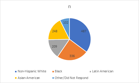
The advantage of pie charts is that they are very easy to follow, especially if you are presenting your research to a non-scientific audience.
However, pie charts are not frequently used in journal articles since they are cumbersome. Journals often set a limit on the number of tables and figures, and it may not be feasible to devote an entire figure to just one aspect of your sample. Also, pie charts make it difficult to spot small differences between frequencies.
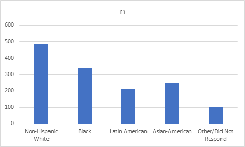
Bar Graph
A bar graph (also known as a bar chart) is a type of graph in which each column represents a categorical variable. Variables can be plotted either vertically or horizontally. The height of a vertical column or the length of a horizontal column denotes frequency.
Below is the same data as above, converted into a bar graph:
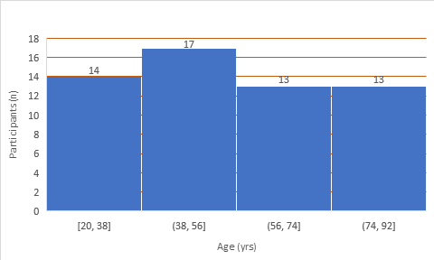
Histogram
A histogram looks a lot like a bar graph, but with some important differences. Unlike a bar graph, it can be used for grouped frequency data, that is, when a continuous variable is divided into artificial classes or groups based on cutoffs that you set. Let’s first take a look at a table showing grouped frequency data for a continuous variable, such as age.
| Age Group | n |
| 20-38 | 14 |
| 39-56 | 17 |
| 57-74 | 13 |
| 75-92 | 13 |
This data can be converted into a histogram as follows:
Key Differences Between a Histogram and a Bar Graph
Although a histogram and a bar graph look similar, they differ in the following ways:
| Histogram | Bar Graph |
| Columns can touch each other | Columns do not touch each other |
| Columns follow a specific order | The order of columns is interchangeable |
| Width of columns may vary | Width of columns is always the same |
| Can indicate if the data follows a normal distribution | Does not provide any information about data distribution |
| Used for grouped frequency data that is originally continuous | Used mainly for categorical data |
Do you want to learn more about analyzing and presenting different frequency distributions? Consult an expert biostatistician, under Editage’s Statistical Analysis & Review Services.


Comment