How to use figures in a research paper: Examples and tips for figure preparation

Jump to Contents
- What Is a Figure in a Research Paper?
- When Should You Use a Figure?
- Figures vs. Tables: Which Should You Choose?
- Types of Figures and When to Use Each
- How to Create Effective Figures: A Step-by-Step Guide
- How to Write Figure Captions and Legends
- How to Reference Figures in Your Manuscript Text
- Formatting and Placement Guidelines
- Common Mistakes to Avoid in Figures
- Ethical Data Presentation in Figures
1. What Is a Figure in a Research Paper?
A figure is any visual representation of data or information in a research paper. This includes graphs, charts, photographs, diagrams, maps, illustrations, and flowcharts. Figures are numbered sequentially and independently from tables (Figure 1, Figure 2, etc.) and are always accompanied by a descriptive caption placed below the image.
Figures make complex data accessible at a glance. Research shows that our brains process images significantly faster than text, which is why readers typically scan a paper’s figures before reading the body. Your figures are not just decoration but are essential in conveying your findings.
2. When Should You Use a Figure?
A simple rule of thumb: if you cannot present your data clearly in one or two sentences, consider a figure.
Use a figure when:
- Your data has a pattern, trend, or relationship that is visually obvious but hard to describe in words
- You are comparing multiple variables or groups simultaneously
- Your data set is too large or complex to summarize in prose
- You want to show spatial relationships (maps, anatomical diagrams)
- You are illustrating a process or workflow
Do not use a figure when:
- A single sentence or short paragraph describes the data adequately
- The data consists of only a few values that are easier to read as text
- The visual would simply duplicate information already in a table
3. Figures vs. Tables: Which Should You Choose?
The decision comes down to what you want the reader to take away.
| Goal | Use a figure | Use a table |
| Show a trend over time | ✓ | |
| Compare exact numerical values | ✓ | |
| Reveal a pattern or relationship | ✓ | |
| Present raw data for reference | ✓ | |
| Illustrate a process or mechanism | ✓ | |
| Allow precise comparison of many categories | ✓ | |
| Highlight one key finding visually | ✓ |
Key rule: Figures emphasize the pattern; tables emphasize the data. Never duplicate the same information in both a figure and a table in the same paper.
4. Types of Figures and When to Use Each
Bar Graphs
Bar graphs display and compare values across discrete, independent categories. Each bar’s height (vertical) or length (horizontal) represents the value of that category.
Best for:
- Comparing groups (e.g., treatment vs. control)
- Showing differences between categories at a single time point
- Displaying ranked data
Example
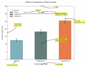
Tips: Start the y-axis at zero unless you have a clear scientific reason not to. Include error bars to show variability. Limit to 5–7 categories per chart to avoid visual clutter.
Line Graphs
Line graphs connect individual data points to show change over a continuous variable, most often time.
Best for:
- Showing trends or changes over time
- Comparing the rate of change between two or more groups
- Displaying continuous data (e.g., temperature readings, stock prices, longitudinal measurements)
Example
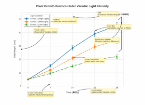
Tips: Use different line styles (solid, dashed, dotted) in addition to different colors so the figure remains legible in black-and-white print.
Scatter Plots
Scatter plots display individual data points along two axes to reveal the relationship (correlation) between two continuous variables.
Best for:
- Showing correlation or lack thereof between two variables
- Identifying outliers in a dataset
- Displaying distributions of data points
Example
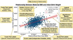
Tips: Add a trend line (regression line) when you want to highlight a correlation. Do not use a scatter plot to compare discrete groups — use a bar or box plot instead.
Box Plots (Box-and-Whisker Plots)
Box plots summarize the distribution of a dataset by showing the median, interquartile range, and outliers.
Best for:
- Comparing distributions across multiple groups
- Showing spread and skewness of data
- Highlighting outliers
Example
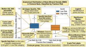
Tips: Use box plots instead of bar graphs when your data is not normally distributed. Always clarify in your caption what the whiskers represent (e.g., 1.5× IQR, 5th–95th percentile).
Heat Maps
Heat maps use color intensity to represent values across a two-dimensional matrix.
Best for:
- Showing patterns across a large matrix of data (e.g., gene expression data, correlation matrices)
- Displaying geographic distributions
- Identifying clusters or hot spots in complex datasets
Tips: Include a color scale bar so readers can decode values. Choose a perceptually uniform color scale (avoid the default rainbow scale in most software).
Histograms
Histograms display the frequency distribution of a continuous variable by grouping values into bins.
Best for:
- Showing how data is distributed within a dataset
- Identifying whether data is normally distributed, skewed, or bimodal
- Describing a population (e.g., age distribution of study participants)
Tips: Choose bin width carefully. Too few bins obscure the distribution; too many create noise. All bins must be of equal width.
Diagrams, Schematics, and Flowcharts
These figures communicate processes, mechanisms, or conceptual frameworks that cannot be captured by a data plot.
Best for:
- Illustrating a study methodology or experimental design
- Explaining a biological mechanism or molecular pathway
- Showing a workflow, decision tree, or conceptual model
Tips: Keep these as simple as possible. Use consistent symbols and fonts. Ensure every element in the diagram is explained either in the caption or a legend.
Photographs and Micrographs
Best for:
- Showing experimental specimens, clinical observations, or field data
- Providing visual evidence in materials science, biology, medicine, and related fields
Tips: Always include a scale bar. State imaging conditions in the caption. If images have been adjusted (brightness, contrast), disclose this and apply adjustments uniformly across all comparative images.
Gels and Blots
Gel images and western blots are among the most scrutinized figures in biological and biochemical research. They are also among the most frequently flagged for manipulation during peer review and post-publication checks. Presenting them correctly is both a scientific and ethical requirement.
Best for:
- Demonstrating protein expression levels (western blot)
- Showing DNA or RNA fragment sizes and separation (agarose gel electrophoresis)
- Confirming gene knockout, knockdown, or overexpression
- Displaying PCR amplification results
Preparing gel and blot images
- Capture at sufficient resolution. Submit gel and blot images at a minimum of 300 dpi. Images that appear sharp on screen may be blurry at print resolution. Always check at actual publication size before submitting.
- Use RGB or grayscale color mode. Most journals, including PLOS titles, accept only RGB (8 bit/channel) or grayscale. CMYK files will be rejected at the submission stage.
- Do not over-adjust brightness or contrast. Adjustments are acceptable only when applied uniformly across the entire image and when they do not obscure, eliminate, or misrepresent any signal, including background noise. Selectively brightening a band, darkening the background, or removing non-specific bands are all considered unacceptable manipulation. The background of a gel image must retain its original “noise”. A completely uniform background is a red flag to reviewers.
- Do not use rubber stamp, clone, or wipe tools to clean up background artifacts or remove stray marks.
Splicing and rearranging lanes
Researchers frequently need to show lanes from non-contiguous parts of the same gel, or lanes run on separate gels entirely. Both practices are acceptable, but only if clearly disclosed.
| Situation | What to do |
| Lanes from the same gel, non-contiguous | Insert a visible dividing line between the spliced sections and state in the caption that lanes have been rearranged |
| Lanes from different gels | Clearly indicate this with a line or border and disclose it in the caption (e.g., “Lanes 1–3 and 4–6 are from separate blots processed in parallel”) |
| Entire figure reused from another panel | Never present the same gel image as representing different experimental conditions. This is an ethical breach, figure duplication |
Grouping images that should be presented separately without marking the splice is explicitly listed as unacceptable manipulation by PLOS and most major journals.
Including loading controls
Always include an appropriate loading control (e.g., β-actin, GAPDH, Ponceau S stain, or total protein stain) on the same blot as your protein of interest. This allows readers to verify that equivalent amounts of sample were loaded in each lane. A blot presented without a loading control will commonly draw reviewer criticism.
Quantification
If you are quantifying band intensity (e.g., for densitometry), state in the methods and caption:
- The software used
- How background was defined and subtracted
- Whether the values are normalized and to what reference
What to include in the caption
A complete gel or blot caption should specify:
- What is being detected (antibody target, staining method)
- Molecular weight markers: indicate the positions of molecular weight standards, either directly on the image or in the caption
- Sample identity for each lane
- Exposure conditions if relevant (e.g., short vs. long exposure shown)
- Whether lanes have been spliced or rearranged
- Loading control used
- Number of independent biological replicates the blot represents
Example caption:
Fig 3. Protein X expression is upregulated following treatment with compound Y. Western blot showing protein X (upper panel, ~45 kDa) and β-actin loading control (lower panel, ~42 kDa) in cell lysates from untreated (lanes 1–3) and compound Y-treated (lanes 4–6) samples. Lanes 1–3 and 4–6 were run on the same gel; a non-contiguous lane has been removed and is indicated by the vertical dividing line. Blot is representative of three independent experiments. Densitometry values normalized to β-actin are shown below each lane.
Common mistakes with gels and blots
| Mistake | Why it matters |
| Cropping out molecular weight markers | Removes essential reference information; makes bands uninterpretable |
| Presenting a single blot as representative without stating how many replicates were performed | Obscures reproducibility |
| Adjusting individual bands selectively | Research misconduct; grounds for retraction |
| Showing unspliced blots where lanes from different conditions appear contiguous | Misleads readers about experimental design |
| Omitting loading controls | Makes quantitative interpretation impossible |
5. How to Create Effective Figures: A Step-by-Step Guide
Step 1: Define the message
Before opening any software, ask yourself: what is the single most important point this figure should communicate? Each figure should carry one clear message that corresponds to one of your conclusions. Use this message as a filter for every subsequent decision.
Step 2: Choose the right figure type
Match the figure type to both your data structure and your message (see Section 4). If you are unsure, show a rough draft to a colleague and ask them what message they read from it. If their answer does not match yours, reconsider the figure type.
Step 3: Be selective with your data
Include only the data necessary to support your message. Supplementary data sets, replicate measurements, and additional controls belong in the supplementary materials, not the main figures. If you must show many data sets, consider splitting them into two smaller figures.
Step 4: Set appropriate axis scales
- Let your data fill the available plot area and do not leave large blank spaces
- Start the y-axis at zero for bar charts; adjust the range for line graphs and scatter plots to show the relevant variation
- Never manipulate axis scales in ways that visually exaggerate or minimize differences without disclosing this
- Always include units on both axes
Step 5: Declutter your figure
Remove everything that does not directly support the message:
- ✗ 3D effects on 2D data
- ✗ Background grids (unless essential for reading values)
- ✗ Decorative borders and shading
- ✗ Excessive tick marks
- ✗ Redundant labels
✓ Keep only the legend, axis titles, axis labels, and data
Step 6: Apply consistent design across all figures
- Use the same color for the same variable throughout all figures in your paper
- Use consistent font sizes, line weights, and marker styles
- Aim for a font size in the final published figure of 8–9 pt (check your target journal’s guidelines)
- Align panels within multi-panel figures on an invisible grid
Step 7: Choose an accessible color palette
- Avoid red-green combinations, which are indistinguishable to approximately 8% of male readers
- Pair colors with secondary cues (line style, marker shape) so figures remain legible in black-and-white print
- Avoid yellow and beige, which are difficult to see on white backgrounds
- For heat maps, use sequential or diverging color schemes rather than rainbow palettes
- Tools like ColorBrewer (colorbrewer2.org) offer scientifically validated palettes for sequential, diverging, and qualitative data
Step 8: Add necessary contextual elements
Include only what is needed for interpretation:
- Scale bars on images and maps
- North arrows on geographic maps
- Error bars on bar graphs and line plots (with the type defined in the caption)
- Trend lines or statistical significance markers where relevant
Step 9: Write your caption last
Once the figure is finalized, write a caption that makes it fully self-explanatory (see Section 6).
6. How to Write Figure Captions and Legends
A figure caption must allow a reader to understand the figure without reading the main text. Most researchers who download a paper look at the figures and captions first. They may never read the full body.
Anatomy of a strong caption
| Element | What to include | Example |
| Title sentence | One sentence stating the main result or what is shown | “Plasma cortisol levels are significantly elevated in the stress group at all time points.” |
| Panel descriptions | Explanation of each panel in multi-panel figures | “(A) Baseline measurements. (B) Post-intervention at 4 weeks.” |
| Sample size | Number of subjects, replicates, or observations | “n = 42 per group” |
| Statistical information | Test used, what error bars represent, significance markers | “Error bars indicate ± SEM. **p < 0.01, Student’s t-test.” |
| Abbreviations | Definition of any abbreviation used in the figure | “CTL: control; INT: intervention” |
| Image-specific details | Scale bar value, magnification, staining method (for microscopy) | “Scale bar = 50 μm. H&E stain.” |
Examples of good vs. bad caption examples
❌ Weak caption: Figure 1. Bar graph showing the results.
This tells the reader nothing. It repeats the obvious (it is a bar graph) and provides no information about what the results are or how to interpret them.
✓ Strong caption: Figure 1. Tumor volume is significantly reduced following combination therapy. Mean tumor volume (mm³) in mice treated with vehicle control (CTL), drug A alone, drug B alone, or combination therapy (A+B) after 21 days. Error bars indicate ± SD. n = 10 per group. ***p < 0.001 vs. CTL, one-way ANOVA with Tukey’s post-hoc test.
Caption placement
- Figure captions go below the figure
- Table titles go above the table
- Both are left-justified
- Figures are read from the bottom up; tables are read from the top down
Figure legends vs. figure captions
These terms are often used interchangeably, but there is a distinction:
- A caption is the full descriptive text beneath the figure
- A legend (or key) is the visual element within the figure itself that explains colors, symbols, or line styles
Both are required for any figure with multiple variables.
7. How to Reference Figures in Your Manuscript Text
Every figure must be cited in the text before it appears. Do not insert a figure that is not explicitly mentioned in the body of the paper.
Acceptable referencing formats
You can refer to a figure in several ways:
- Parenthetical: Tumor volume was reduced by 60% in the combination therapy group (Figure 3).
- Passive voice: Results are shown in Figure 3.
- Clause with “as”: As shown in Figure 3, combination therapy produced the greatest reduction in tumor volume.
- Active voice: Figure 3 illustrates the dose-dependent increase in cell viability.
What not to do
❌ Do not simply repeat the caption: Figure 1 shows the change in temperature over time. (This only restates what the caption already says.)
✓ Do add new information when citing: Temperature followed a sinusoidal pattern, peaking at 37°C at 6-hour intervals (Figure 1). (This adds interpretive value to the reference.)
Numbering rules
- Number figures in the order they are first mentioned in the text. Figure 1 must appear in the text before Figure 2
- Figures and tables are numbered independently (Figure 1 and Table 1 can both exist)
- Supplementary figures carry a separate numbering system (e.g., Figure S1, Figure S2)
8. Formatting and Placement Guidelines
General placement rules
- Give priority to journal guidelines. Many journals ask for figures to be in a separate file or at the end of the paper.
- If the journal asks for figures to be included in the main text, place each figure as close as possible to the paragraph where it is first mentioned
- Figures should be centered on the page.
- Text should not wrap around figures. Set figures apart from the body text
Resolution and file format requirements
| Purpose | Minimum resolution | Recommended format |
| Line art (graphs, diagrams) | 1,000 dpi | EPS, PDF, or high-res TIFF |
| Halftones (photographs) | 300 dpi | TIFF or JPEG (high quality) |
| Combination (graph + photo) | 500 dpi | TIFF |
| Cover image (decorative only) | 72–150 dpi | PNG or JPEG |
Most journals publish figures in a specific column width. Check the target journal’s guidelines for maximum figure width (typically 8.5 cm for single column, 17.5 cm for double column).
Figure size and readability
- All text within a figure (axis labels, legends, annotations) must be legible at the published size
- Target a final font size of 8–9 pt in the published figure. This means your source file font may need to be larger depending on how much the figure will be scaled down
- A figure that requires a magnifying glass to read has failed
How many figures to include in a paper?
There is no universal rule, but general conventions suggest:
- Short communications: 1–3 figures
- Research articles: 4–8 figures
- Review articles: as many as needed, but aim for maximum information density per figure
When in doubt, less is more. Combining related data into a well-organized multi-panel figure is preferable to submitting many small, sparse figures.
9. Common Mistakes to Avoid in Figures
| Mistake | Why it matters | How to fix it |
| Figure not referenced in the text | Violates basic manuscript conventions; may trigger reviewer comments or rejection | Ensure every figure has at least one citation in the body text |
| Caption that repeats the figure title only | Wastes the caption as readers learn nothing new | Write captions that state the main finding and provide methodological detail |
| Wrong figure type for the data | Misleads readers or obscures the finding | Match figure type to data structure (see Section 4) |
| Figures not numbered sequentially | Confuses readers and reviewers | Number figures in order of first appearance in the text |
| Figures and tables duplicating the same data | Redundancy that wastes journal space | Present data in either a figure or a table, not both |
| Missing error bars or statistical markers | Undermines the scientific credibility of the figure | Add error bars to all group comparisons; define them in the caption |
| Inaccessible color combinations | Excludes colorblind readers; figures unreadable in grayscale | Avoid red/green pairs; use line style and shape as secondary cues |
| Cluttered design (3D effects, gridlines, excessive labels) | Makes figures harder to read, not easier | Remove all non-essential visual elements |
| Low-resolution images | May cause rejection at the submission stage or poor print quality | Use minimum 300 dpi for photos, 1,000 dpi for line art |
| Manipulating figures unethically | Research misconduct; can result in retraction | Report only accurate representations; disclose all image adjustments |
10. Ethical Data Presentation in Figures
Figures are subject to the same standards of research integrity as any other part of your manuscript. Manipulating figures to misrepresent data is a form of research misconduct with serious consequences, including retraction.
Acceptable practices:
- Adjusting overall brightness and contrast uniformly across an entire image (if disclosed)
- Cropping an image to remove irrelevant background (if the cropped area contains no relevant data)
- Using false color in fluorescence microscopy to represent different channels (standard practice, should be stated in the caption)
Unacceptable practices:
- Selectively brightening or darkening regions of a microscopy image
- Removing data points from a graph without justification and disclosure
- Manipulating axis scales to make a non-significant difference appear large
- Duplicating or reusing images across different experimental conditions without disclosure
- Presenting composite images as if they are a single original image
When in doubt, consult your institution’s research integrity guidelines and your target journal’s image preparation policies before finalizing your figures.
Frequently Asked Questions
How many figures should a research paper have?
There is no fixed rule, but a typical research article includes between 4 and 8 figures. The right number depends on how many independent findings need visual support. Avoid padding with redundant figures. Each one should add something that cannot be conveyed in the text or a table.
What is the difference between a figure and a table?
Figures are visual representations (graphs, images, diagrams). Tables present data in rows and columns. Figures highlight patterns and trends; tables allow precise comparison of values. They are numbered independently and serve different purposes.
Where do figure captions go?
Always below the figure, left-justified. Table titles go above the table.
Can I use the same figure in multiple papers?
Generally no, without permission. If the figure has been published before, you must obtain copyright permission from the original publisher and disclose the source in your caption. Re-use of your own previously published figures without disclosure can constitute duplicate publication.
What does “self-explanatory figure” mean?
A self-explanatory figure is one that a reader can fully interpret using only the figure itself and its caption, without needing to read the main text. This is the gold standard for scientific figures.
What is a supplementary figure?
A supplementary figure is additional visual data placed in the supplementary materials section rather than the main paper. It typically contains supporting or confirmatory data that is not central to the main argument. Supplementary figures are numbered separately (Figure S1, Figure S2, etc.) and must still be referenced in the main text.
Should figures be in color or black and white?
This depends on the journal and the publication format. Many journals charge extra for color figures in print. Design your figures to be interpretable in grayscale by default, and use color as a supplement, not the only means of distinguishing variables.
Can I use AI to make or enhance my figures?
AI-generated images are generally banned in academic journals. Elsevier, for example, states firmly “We do not permit the use of Generative AI or AI-assisted tools to create or alter images in submitted manuscripts.” Wiley is equally strict about forbidding the use of AI to generate, modify, or enhance any kind of image that is meant to support specific scientific, clinical, or technical claims (like experiment results or diagnostic images). However, Wiley does permit some use of AI tools to create process flows, workflow diagrams, or flowcharts as these images don’t actually convey your research data. So you should check the guidelines of your target journal before submitting any AI-generated/modified figure, and when in doubt, don’t use AI for figures at all.
This article was originally published on March 1, 2023, and revised on April 22, 2026.